pharmacy rebranding
Pharmacy rebranding is the process of changing a brand’s image, which may include modernising the logo, visual identity, and even the name, to improve its market position, refresh its image, and regain competitiveness. Examples include visual changes, such as a new logo and identity system, as well as more profound transformations that include changes to the offerings and communication methods.
Key aspects of pharmacy rebranding:
- visual change: refreshing or completely redesigning the logo, colors, and other graphic elements,
- name and strategy change: in some cases, rebranding may include changing the company name and redesigning the entire marketing and communication strategy.
Why do pharmacies rebrand?
- loss of competitiveness: rebranding is necessary when a brand becomes outdated or loses its competitiveness, which can lead to a decline in customer numbers,
- need for image refreshment: to adapt the brand to contemporary trends and customer needs,
- improving market position: the image change aims to create a better and more attractive image of the pharmacy, which translates into an increase in its market position.
pharmacy rebranding Poland
More and more companies – including pharmacies and other entities from the health sector – decide to rebrand in Gdańsk and the Tri-City. This process can be a response to market changes, new technologies, as well as the desire to adapt to changing customer needs and trends in visual communication.
At B52, we offer a full range of advertising and decorative printing services, utilizing various technologies, including UV printing and eco-solvent printing, which meets sanitary standards. As an advertising manufacturer, we produce products such as:
- pharmacy signs, light boxes, signle letters,
- window and door wrapping (printed advertising films, one-way vision films, frosted films),
- information boards and displays,
- POS printing: posters, price lists, pendants, and flyers.
Gdańsk, as one of the most important business centres in Poland, is a place where many companies from the pharmaceutical industry decide to rebrand. Thanks to this, they are able to effectively stand out from the competition. Rebranding in the Tri-City is today one of the key marketing activities that allows companies to develop and better position themselves on the local and national market.
pharmacy rebranding Tri-City, Poland – consistency, technology, patient
- consistent network and local branding – in the process under the slogan pharmacy rebranding Tri-City, we create or implement a uniform identity system – from illuminated signs, through vinyl-covered windows, to ergonomic interior markings. The whole thing harmonises with the urban architecture of Gdańsk, Gdynia, Sopot and other cities,
- loyalty and image – the new branding is not only aesthetics – it is building a relationship with the customer: clear navigation, graphics communicating locality, clear promotion zones and direct CTA.
Pharmacy rebranding is much more than just changing the logo or correcting the company colour scheme. It is a comprehensive process of transforming the brand strategy and its communication with the environment. Properly conducted pharmacy rebranding Poland allows you to create a modern and attractive image of the facility that attracts the attention of recipients and increases their loyalty. Refreshing the brand often translates into increased sales, better recognition on the market and acquiring new customers.
Although in theory rebranding may seem like a simple solution, in practice it requires careful planning and efficient implementation. Changing the visual identity of a company is most often associated with the use of various technologies used in advertising and printing. That is why the support of an experienced partner is so important. B52 has the appropriate knowledge, experience and technological background, thanks to which it is able to efficiently and comprehensively perform the tasks entrusted to it.
Professional pharmacy rebranding Tricity Poland means increased foot traffic, better sales results, and consistent identity within the chain – without losing the local character.
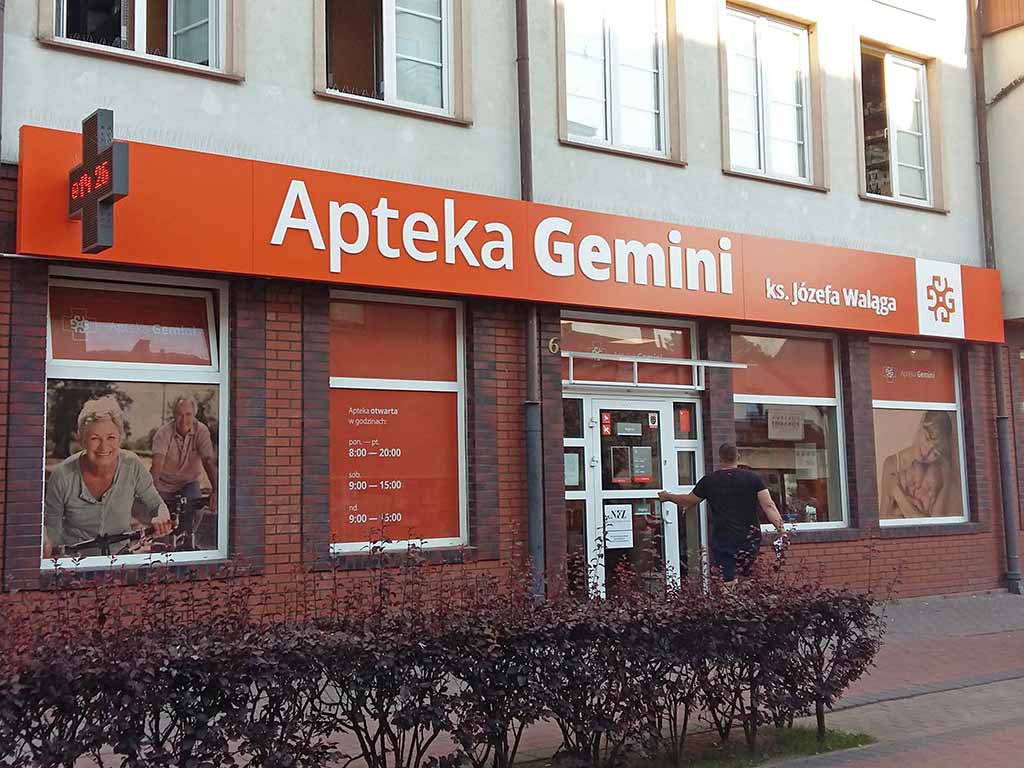
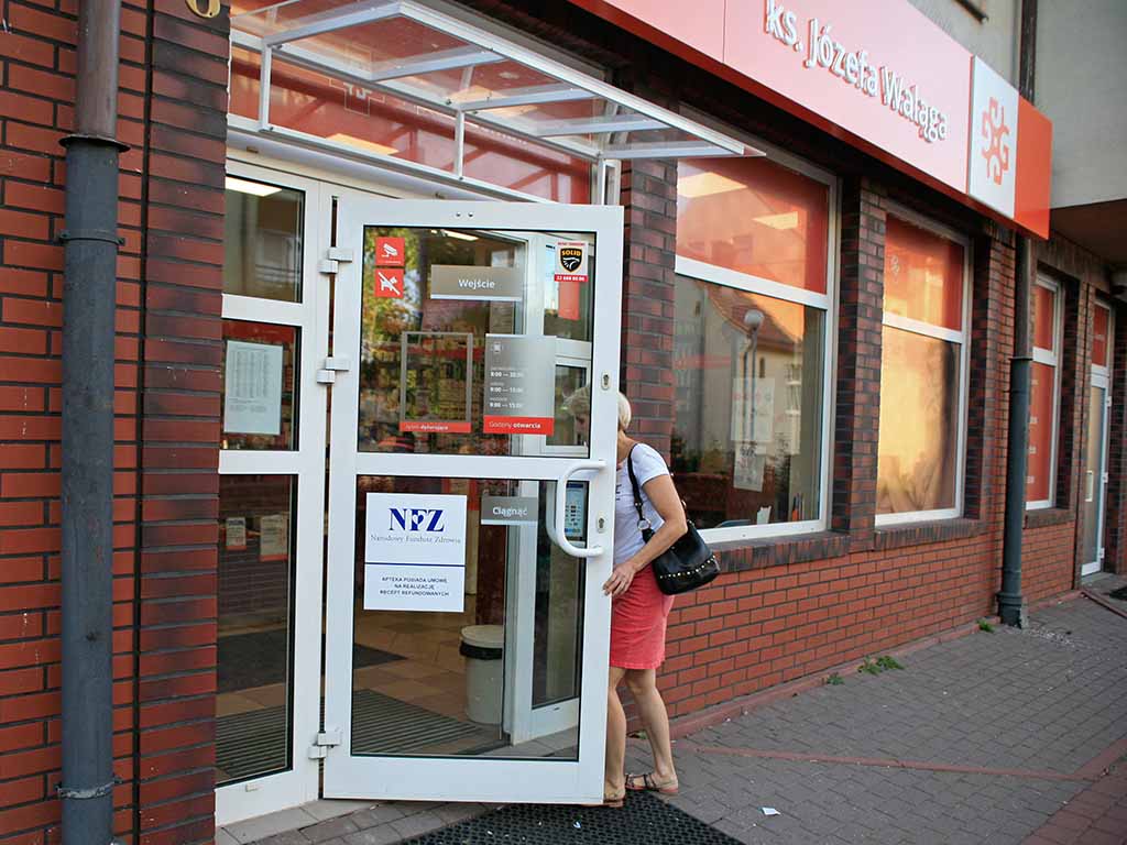
In the photos: rebranding of a network pharmacy – signboard in the form of a light box, large format printing on perforated film, information labels. Shop rebranding.
See also: shop rebranding, rebranding / brand image change