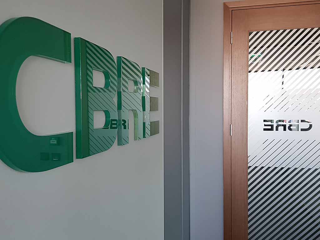
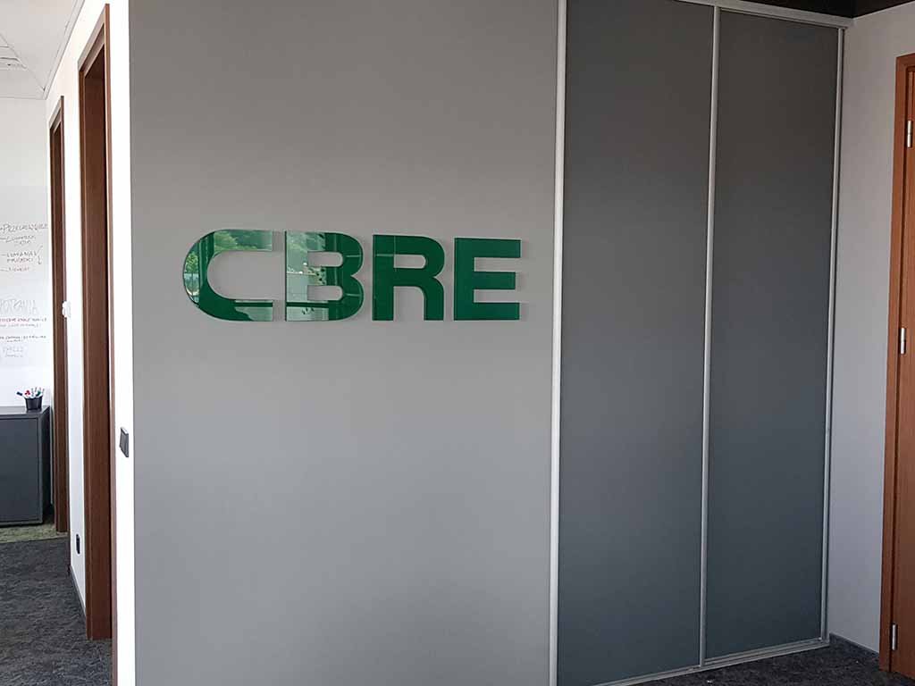
office signage
Office signage. Wall logotype: made of 10 mm thick acrylic with dark green film applied to the back side. Laser cutting provided the glassy edges of the letters. Wall mounting. Doors: plotter cutting of decorative dusted film with application.
Office visual identity. Frosted film on the glass. Acrylic letters. Plexiglas letters. Acrylic laser cutting. Plexiglas laser cutting.
Office signage is an important element of the company’s image. The company logo should be one of the first elements of office marking. They should be placed centrally, e.g. on the wall, at the reception desk, so that they immediately attract attention and increase the company’s recognition. Don’t forget about the identity graphics at the entrance to the office.
The colours of the office should be consistent with the visual identity of the company. Office marking should be consistent and aesthetic so that it has a positive impact on customers and employees.
Signage of zones (rooms) in the office can help organise work and increase efficiency. Zones for different departments, e.g. for the sales department or the creative department, can be additionally distinguished by colour.


